
Rebolet
eCommerce for Reseller Marketplace: A Case Study
Rebolet, a Berlin-based returns and overstock redistribution powerhouse akin to the American Optoro, sought out a branded solution to the need for a B2C marketplace as they hope to move in-house and away from third-party marketplaces such as Amazon and Ebay. My four-person ux team set out to assist with Rebolet’s goal to be seen as trustworthy, easy and transparent while providing customers with high quality products at discounted prices. As both designer and project manager, I collaborated across multiple time zones to deliver a user-focused marketplace for our international client.
Logistics
- Duration: 3 weeks
- Dispersed 4-person Team
- Platform: responsive website
- Figma (wireframes + prototype)
Constraints
- Collaborating across multiple time zones
- Independent designer simultaneously working on the main Rebolet platform and partner dashboard
User Interviews
- 6 Users
- Ages 20-40
- Conducted Remotely via Zoom
- Reseller Shoppers
- Affinity Map
Competitors + Comparators
- 7 Competitors
- 8 Comparators
- Feature Inventory
- Account & Checkout
- Sustainability
Testing
- 1 Round of Usability Testing
- 6 Users
- Ages 23-40
- Moderated via Zoom
Discover
After meeting with our client to ensure a clear understanding of their company values and business goals for the new marketplace, we set out to research Rebolet’s competitors to gain inspiration from successful solutions to reselling challenges as well as to gain experience from the less than successful solutions.

Business Needs & Goals
NEEDS: B2C marketplace to sell returned and overstock items from partner business to individual buyers
GOALS: To be seen as trustworthy, easy and transparent
To provide customers with high quality products at discounted prices
To emigrate customers from third-party reselling channels to a custom storefront
How might we provide a high quality experience for users while turning the limitations inherent to a reseller site, namely limited and unpredictable stock, into assets?
Competitive & Comparative Analyses
As a team we delegated focused analyses around overall features of competitors as well as account function, checkout flow, and sustainability efforts of both competitors and comparators. After diving into 15 companies, there were a few major points of inspiration.
Watch The Video
You could read about the highlights from our C&C analyses or you can watch my excerpt from the client presentation!

Major US Competitor
A major American competitor, Optoro shares a similar business model with Rebolet and Blinq is their B2C marketplace. We took note of a few of the common reseller challenges that we felt they solved quite well:
Product Conditions & Limited Stock
Reviews for Seller, Not Products
Sustainability Blog
Let it Breathe
With all they’ve got going on, Blinq can be a bit visually overstimulating. I find it never hurts to have a reminder to leave space to breathe and rest the eyes.

Nike Purpose
Nike takes leading with values to the next level with a site devoted to not only their sustainability initiatives, but their equality and community efforts as well.
They illustrate how it isn’t enough to simply have a strong brand and a quality product. You need to stand for something and build a relationship with your users around shared values.
While Nike Purpose goes beyond what is feasible for Rebolet at this time, it’s a great indicaion of what is possible. Quite the aspirational goal.
User Preferences
A repository for deals and discounts in the travel and adventure space, Kayak afforded us some great inspiration on account features and functions.
- User-tailored “Price Alerts” drive shoppers back to the site on their terms
- Curated brand preferences allow users a custom shopping experience
- Friendly voice & tone welcome users back and make them feel at home

Define
Now that we’ve talked around our users, it’s time to talk to our users. Defining who our users are and what matters to them is at the center of this work, so let’s dive and see what we can learn from the users.

Affinity Map Takeaways
After conducting six remote user interviews via Zoom with users aged 20-40 years old, we synthesized the findings using an Affinity Map to draw out prevailing themes. The following five insights emerged:
Return Policy
Even if users are unlikely to return items, they need to feel confident in the shop’s return policy.
Product Condition
Users want photos of the actual item and accurate description to insure the item ordered matches what arrives
Organization
A well organized storefront empowers users and provides them with a trustworthy and enjoyable shopping experience.
Seamless & Secure
Users remember positive checkout experiences and make note to return to those sites.
Sign Up
Users avoid signing up for accounts unless there are clear benefits to doing so and/or they have used the site 2+ times.

Meet Nadia | User Persona
American Graduate Student| 25 year-old
Studying abroad in Germany, Nadia is an avid swimmer both for physical and mental health. She often needs to replace her quality gear, but needs to due so on a budget. She’s willing to hunt for a good deal and wants to know she’s shopping eco-consciously.
Nadia needs to feel confident in the products she purchases from resellers.
She needs a trustworthy online shop where she can get great deals on her student budget.
Confusing navigation and store policies can make it frustrating to shop reseller sites.
The Opportunities
With some colorful language quoted directly from our user interviews, we crafted a problem statement encapsulating the challenge before us:
Nadia needs an experience that is organized, trustworthy, and transparent in order to feel confident when shopping reseller sites because she feels “betrayed” when an item arrives in a condition other than stated.
How might we create a trustworthy experience for shoppers when buying limited stock, open box and overstock items?
How might we maintain joy and appeal while accurately conveying an item’s condition?
Information Architecture
One of the key considerations for the organization of the marketplace is the ever changing product inventory. We needed broad, yet effective categories so that none would be empty due to too specialized a classification during inventory changes. From there we employed further filtering to give users the customized search they crave.
Design
Designing for Nadia
Facing the challenge of a short sprint, we elected to jump start the creative juices with a design studio collaborating across multiple time zones.
We focused on four major pages on the site: Home page,
Sustainability page, Product Detail page, and Account dashboard.


Going Digital
We composited the multiple hand sketched ideas into main sketches as launching places for the digital wireframes.
Usability Testing
We did moderated usability tests via Zoom using a Figma prototype. Six users aged 23-40 years old were given the following scenarios and tasks:
1) Imagine you have a swim competition coming up. You want to buy a ‘Nike Swim Cap’ so you go on Rebolet’s resale website to find what you need. Show me how you would find the item to add to your cart for check out.
2) Now that you have found the item you needed and added it to your cart, you are ready to check out as a guest. Show me how you would complete placing your order.

Completion Rate
All six usability testers were able to complete the tasks asked of them. However there was still room for improvement.
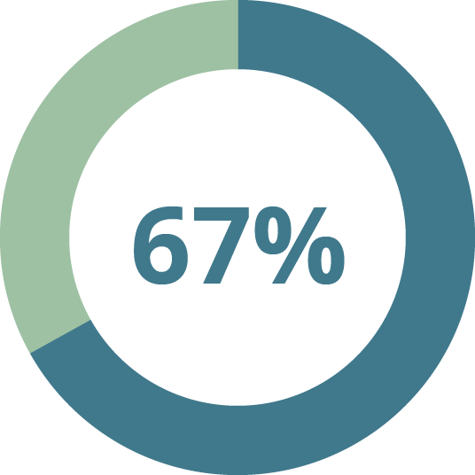
Locate Item
67% of testers were able to locate the item and add it to their cart in the target 2 minutes or less.
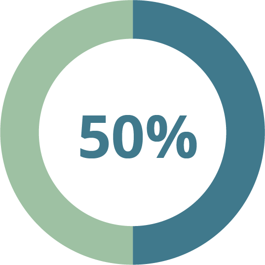
Smooth Checkout
Half of the usability testers were able to complete the checkout process in the target 10 clicks or less.
Iteration Highlights
Add to Cart
We noted confusion in users due to the placement of the Add to Cart button above necessary product considerations. In iteration we elected to move the call to action button below color selection and other buying options to align with user intuition.

Checkout Flow
Users were slowed down during the checkout flow because of the unintuitive placement of the continue button. Users wanted to utilize the expanding dropdown sections to advance through checkout. We solved for this pain point by moving the Continue within each section.

Deliver
Mid-High Fidelity Wireframes
Mid-high-fidelity wireframes were presented via Figma clickable prototype. Click through as the user, Nadia, to locate and purchase a new Nike Swim Cap. But don’t stop there! You can click through to create a new account for Nadia as well by following the prompt to do so after checkout.
In delivering designs to the client, I included full annotations to set up their internal product team and developers to be able to effectively translate our designs into reality.


Mobile Wireframes
Considering the website’s mobile responsiveness is key to providing for the user’s need for ease across devices. Whether shopping from the home computer or a mobile phone while on the go, Rebolet and its users require a reliable responsive experience.
Mobile Wireframes
Considering the website’s mobile responsiveness is key to providing for the user’s need for ease across devices. Whether shopping from the home computer or a mobile phone while on the go, Rebolet and its users require a reliable responsive experience.
High Fidelity Mock Ups
Mock ups help the client picture how their live site could look with products and branding. We elected to add two shades of green to the color palette to showcase Rebolet’s sustainability and eco-friendly efforts.
View a scrollable prototype of the Home Page Mock Up HERE.
Design System
Working with a startup gave our team the opportunity to evolve and expand their branding and design system. In addition to formalizing colors and typography, we gave them guidelines for tone and the friendly voice they are looking for throughout the B2C marketplace.
A tiny taste of the design system is shown with the expanded brand colors.

Next Steps
In addition to the testing and research proposed building on the B2C marketplace for Rebolet, we have set up the B2B marketplace for its creation. The B2B marketplace would take a more professional tone with the Blue Zodiac (navy) taking the lead rather than the Curious Blue (light blue) from the B2C site.
Mobile Testing
Construct mobile responsive prototype for usability testing.
Does the ease of use transfer on the go?
What is different about how mobile users interact with the site and how can that inform design?
Account Testing
Usability test the Account flow and features already designed.
How else might we provide a high quality experience on a discount site?
Product Grading
Solidify conditions grading system in conjunction with product receiving and warehouse operations.
B2B Marketplace
Design a B2B marketplace which is consistent with the B2C design that accounts for its unique needs in selling bulk product overstock to businesses.
Thank you!
I really appreciate you taking the time to learn about how I work. Feel free to learn more about me or reach out to connect about this project or a brand new one!