
YouTube Music
Curating the Curated: A Case Study
Our three person design team was presented the opportunity to solve an as yet undetermined user problem by creating a new feature for the YouTube Music app while keeping the business needs in view as well. While in corporating Agile methods, we conducted a two-week design sprint. Join me as we solve for curating the curated within the app!
Logistics
- Team: Jen (PST), Miles (CST), Meghan (MST)
- Platform: iOS (based on user research)
- Sketch App (wireframes & mockups)
- InVision (prototype)
Constraints
- Duration: 2 Weeks
- Use Existing Brand Style
- Derive & Develop Design System
- Work Across 3 Time Zones
User Interviews
- 5 Users
- Ages 25-45
- Conducted Remotely via Zoom
- 2 Free Users, 3 Premium Users
- 3 Contextual Inquiries
- Affinity Map
Teamwork makes the dream work
Working on this project with a new team of ux specialists meant an extra step before beginning the full user experience process: setting up a project plan and a functional team plan. A project plan is crucial to keep everyone moving in the same direction on the same timeline. While that is certainly an integral piece of the puzzle, I dare say the functional team plan may even be more important. We laid out for each other our boundaries, our schedules as we worked across time zones, methods of communication, how we would resolve conflict, and how we would administer feedback and support among other important details.
Discover
Before we can begin, we must know where it is we are beginning. To that end, the project starts with me leading the research efforts to get the big picture view on the current application and its users.
The State of the App
As brand new users to YouTube Music, we began by diving into personal heuristic evaluations in order to build a base of knowledge before interviewing users as well as to get a preliminary sense for potential user experience upgrades.
Along with my teammates, I found the following to be the most useful takeaways:
- The current design is solid, well incorporated, and holds up to the industry standards.
- Challenges in the app are as yet not obvious, though we noted that upholding the current design system would be beneficial not only to the business, but to the users as would prove even more clear as the Discover phase continues.
Meet the Competition
At this time we also completed competitor analyses, namely a feature analysis and a task analysis, in order to form an accurate picture of how YouTube Music stacks up against Spotify, Apple Music, Pandora, and Amazon Music.
Reviewing the competitive analysis of features present across the five music platforms including YouTube Music, it’s clear that the app is holding its own among the other music streaming apps. Furthermore YouTube Music comes out ahead with its videos, unique in music apps and a trademark of its parent platform, YouTube.


Interviewing the Users
Our personal heuristic evaluations gave us some avenues to explore as we approached user interviews.
We drafted questions to probe frequency of use, context of use, engagement with new music, interaction with playlists and recommendations, and perspective on the paid subscription with room for users to share things we might not have thought to ask their experience with.
Taking the lead on user research, I conducted our five user interviews with a mix of premium (3/5) and free (2/5) users.
Define
As we moved from collecting research to making sense of the whole thing, we teased out opportunities for improvement from interviews otherwise containing much fondness for the YouTube Music app. To put it succinctly, users LOVE the app, so we want to be careful in proposing features that we preserve that affection.

Two User Personas
Premium YouTube Music subscribers & Free Users
Suggested Music
Like recommended music when it’s on-track, but get frustrated when off-track
Navigation
Prefer the path of least resistance as they navigate to find their desired music.
Affinity Map Takeaways
After conducting five remote user interviews and three contextual inquiries via Zoom with users ages 25 to 45, we synthesized the resulting insights using an Affinity Map.
Who are the users & What’s Important to them?
After teasing out the research, we had a chance to get to know our two user personas a bit more closely.
Two User Personas
Premium YouTube Music subscribers & Free Users
Suggested Music
Like recommended music when it’s on-track, but get frustrated when off-track
Navigation
Prefer the path of least resistance as they navigate to find their desired music.

Meet Richard | Primary Persona
Premium Subscriber| 35 year-old professional
He uses music whether it’s for work, exercise, or anything else to set the tone. He often ends up using what is provided by the app since he doesn’t spend much time making 100% custom playlists.
Richard gets annoyed when suggested music doesn’t match his tastes. It’s frustrating that her can’t edit and tweak to perfection.

Meet Jill | Secondary Persona
Free User| 28 year-old IT professional
She uses her daily commute to check social media and listen to new music. Jill finds a thrill in being the first to discover a new artist or track. She gets frustrated when the app makes it difficult to multi- task and can’t use any other app to share with her friends.
Jill needs a way to listen to her music without feeling overwhelmed by ads.
Jill has a hard time falling in love with YouTube Music when she has to stop listening to respond to a friend’s text message.
The Opportunities
We decide as a team to focus on our primary and premium user, Richard. Jill won’t be forgotten, but for now let’s focus on Richard as Jill will also benefit from any solutions to his frustrations.
Richard needs an intuitive way to interact with his app’s personalized features because it’s frustrating to have to navigate around poorly generated suggestions when sharing socially and being exposed to new music.
How might we better tailor auto-generated playlists to users’ personal taste?
Design

Hand sketched Thumbs-Down user flow refined following team Design Studio

Hand sketched Thumbs-Up user flow part I refined following team Design Studio

Hand sketched Thumbs-Up user flow part II refined following team Design Studio
Designing for Richard
After performing a design studio as a team in which we structured time to brainstorm design solutions, alternating hand sketching with feedback to pull out multiple ideas in a short sprint, the resulting list of potential features was then placed into a prioritization matrix to help us focus in on the scope we wanted to explore in our two week project.

Prioritizing Focus
We elected to focus on improving curated playlists with like/dislike functionality to update preferences similar to the capability for individual songs as well as the ability to edit curated playlists due to the high potential impact and the relatively low effort involved. We decided to back-burner our feature allowing the Home screen to be customizable due to the testing complexities as well as the high potential effort on the part of developers to make such functionality possible.
Design System
Handmade sketches were refined considering our priority to remain within the current layout and design system. We wanted our feature(s) to fit seamlessly into the app our users already love so much.
To create our roadmap, we identified a design system to keep us on course. Some was pulled from YouTube’s brand guidelines with other pieces either intuited from the YouTube Music app or added new through our designing.


Going Digital
With ideas sketched in full, designs were then digitized in Sketch producing mid-fidelity wireframes to be utilized in an InVision prototype for usability testing.
For me this was the first time prototyping wireframes built by a colleague. It helped me be knowledgeable about a phase of the work even though I wasn’t the lead designer. It also served as a great way to test the ideas present in the wireframes ahead of the users.
Usability Testing Round One: Unmoderated Becomes Moderated
In our first round of usability testing with three premium users aged 19-39 years-old, we planned an unmoderated test using an InVision prototype tracking along a proposed user flow with the following scenario and task: You like a system-curated playlist but it’s not quite perfect. Please show me how you would access the playlist and make changes.
Plans were quickly derailed as our assumptions were immediately challenged. Users hit troubles as soon as they began needing more guidance proving how things were not as intuitive as we’d hoped. Looking at the complexity of the user flow for this brand new feature might shed some light on why…

Major Takeaways for iteration
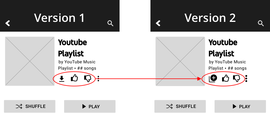
Thumbs Up Affordance
We’d thought we could get rid of the Add to Playlist icon and roll it into the functionality of the Thumbs Up/Down. The affordance proved to only uphold liking and disliking respectively.
In iteration, we elected to bring back the Add icon and move the download function to the More Options menu for space saving.

Onboarding
Users reflected on the newness of being able to edit recommended playlists which led us to consider the benefit of adding function-oriented onboarding support for the new feature.
In iteration we added a pop-up that would appear the first time some accessed a recommended playlist as well as prompts following thumbs up and thumbs down letting users know how that would affect later recommendations.

User Flow & Navigation
We discovered that our planned user flow left users lost in the middle which presented us with the opportunity to streamline the functionality so that selecting to add the playlist took the user immediately into that saved copy in their Library for editing as they see fit.
Clicks in Time
We knocked down a confusing 9-click flow to a speedy 6 clicks from start to finish!

Usability Testing Round Two: Process Continues
With iterations to answer the questions posed in the results of Round One, we moved into a second round of unmoderated testing with a new set of three premium users aged 21-31 and a new InVision prototype. We were able to move into mockups for presentation after this round of testing. However one noteworthy takeaway for next steps considerations caught our attention: how might we design more effective onboarding that encourages users to read/interact with the new information?
Deliver

Annotated Wireframes
As we wrapped up our two week sprint leading into stakeholder presentations, I laid out our design thinking in annotated wireframes. Organized, clear, and concise, stakeholders would be able to understand the ins and outs of what my colleagues and I propose.
Mock Up Prototype
One of my teammates brought our wireframes to mock up before handing them off to me to once again bring our designs to prototype.

Value Add: Home Screen Redesign
Early on in our ideation process, we identified a possible solution for aiding our users in further personalizing their app. Namely a home screen with the ability to be reordered. A long click and hold would activate the function allowing users to drag and drop the different home screen sections into a new order.


Next Steps
With any subsequent time allotted, we targeted several additional things we would like to investigate, design, and test.
Home Screen Redesign
While we elected not to develop the feature fully at this time due to scope, we simulated an idea for a customizable Home screen with moveable modules that would activate with a long hold, then be able to be dragged and dropped into a new order. Testing for this feature would include a variety of hold lengths to help determine the best for ease of use and to avoid frustration with pieces moving unintendedly.
Considering Jill
While the pain points for the secondary user revolve around the paywall, we believe there is an opportunity to still uphold the business model while increasing the enjoyment of the free user by reducing some of the frustration around interrupted listening and overwhelming ads. If the paywall limits the ability of the user to fall in love with listening via YouTube Music, it makes it challenging to convert them.
Human Psychology
How might we make onboarding tutorials more likely to be read by our users? We played with color in the mockups to help draw our users to the onboarding prompts, but would be interested in testing animation and/or interaction within onboarding prompts to increase impact without overwhelming the user with too much hullabaloo.
Personal Lesson
As individuals and as a team we practiced an Agile retrospective which brought useful insights up for next time.
Hesitant to force a project management role, I held back to let the team dynamic shine. A greater present of a project manager to guide and time manage might have been beneficial in helping reduce wasted time.
Thank you!
I really appreciate you taking the time to learn about how I work. Feel free to learn more about me or reach out to connect about this project or a brand new one!