
Children's Screen Time Action Network
Resource Library Part I: A Case Study
Part I of this project really turned out to be about storytelling. But let me start at the beginning. In December 2020 I was contracted by Boston-based non-profit Children’s Screen Time Action Network to use UX strategies to improve their biggest asset: a library of resources around healthy screen time usage for kids. Here’s where things got a little different for me…my discovery and defining stages focused around data from a survey study and website analytics that I neither conducted nor compiled. As a result, the research wasn’t always user experience focused. I needed to get a big picture view and tease out behaviors and trends to piece together who the users are and how they engage with the library. With some classic laws of ux and effective journey maps, I was able to bring the user personas to life for my client and pave the way for the designs to come in 2021.
Logistics
- Short-term contract
- Working Solo
- Platform: responsive Drupal website
- Adobe XD
Constraints
- Client in EST
- Limited resources, relaxed timeline
- Web Designer simultaneously working on overall site
Existing Research
- Survey conducted Summer 2020
- 52 participants, Parents/Caregivers + Educators/Practitioners
- Website analytics compiled March – August 2020
Competitors + Comparators
- 4 Competitors & Comparators
- Content Inventory
- Filter Inventory
- Information Architecture
Deliverables
- Two User Personas
- Three Journey Maps
- One Presentation Deck
- And a partridge in a pear tree.
Discover
During my client discovery meetings, it was clear that they knew they had fundamentally a good thing on their hands and sincerely wanted to make it better for the people that use it. They are passionate about their mission to support practical solutions to the excessive technology use harming youth and families. What they aren’t is a big company with tons of resources. So I was working with user data and web analytics from earlier in the year as conducted and compiled by two different college interns. With hopes that a user experience designer could use the resulting pile of information to tell them about the people they serve, they asked me to strategize improvements to their resource library.
Business Needs & Goals
NEEDS: To have the Resource Library be well-organized, efficient to navigate, and useful
GOALS: To convert more visitors to the Resource Library into Members (free!)
How might we eliminate inefficiencies in the Resource Library while increasing value and the likelihood of joining?
The State of the Users
From the user survey conducted I learned that the people using the library are primarily childhood educators with parents/caregivers not far behind.
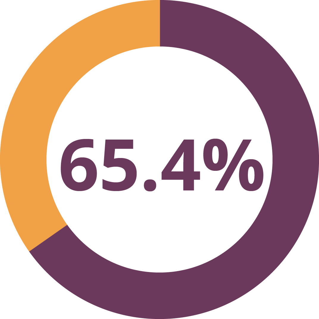
Early Childhood Educators & Practitioners
Parents & Caregivers
Important to note about usage – the primary application for the library is giving resources to parents. Whether resources for parents or for their own professional application, educators are the heaviest users while reinforcing the importance of considering the parents that they recommend to the site.
Find Resources for Parents

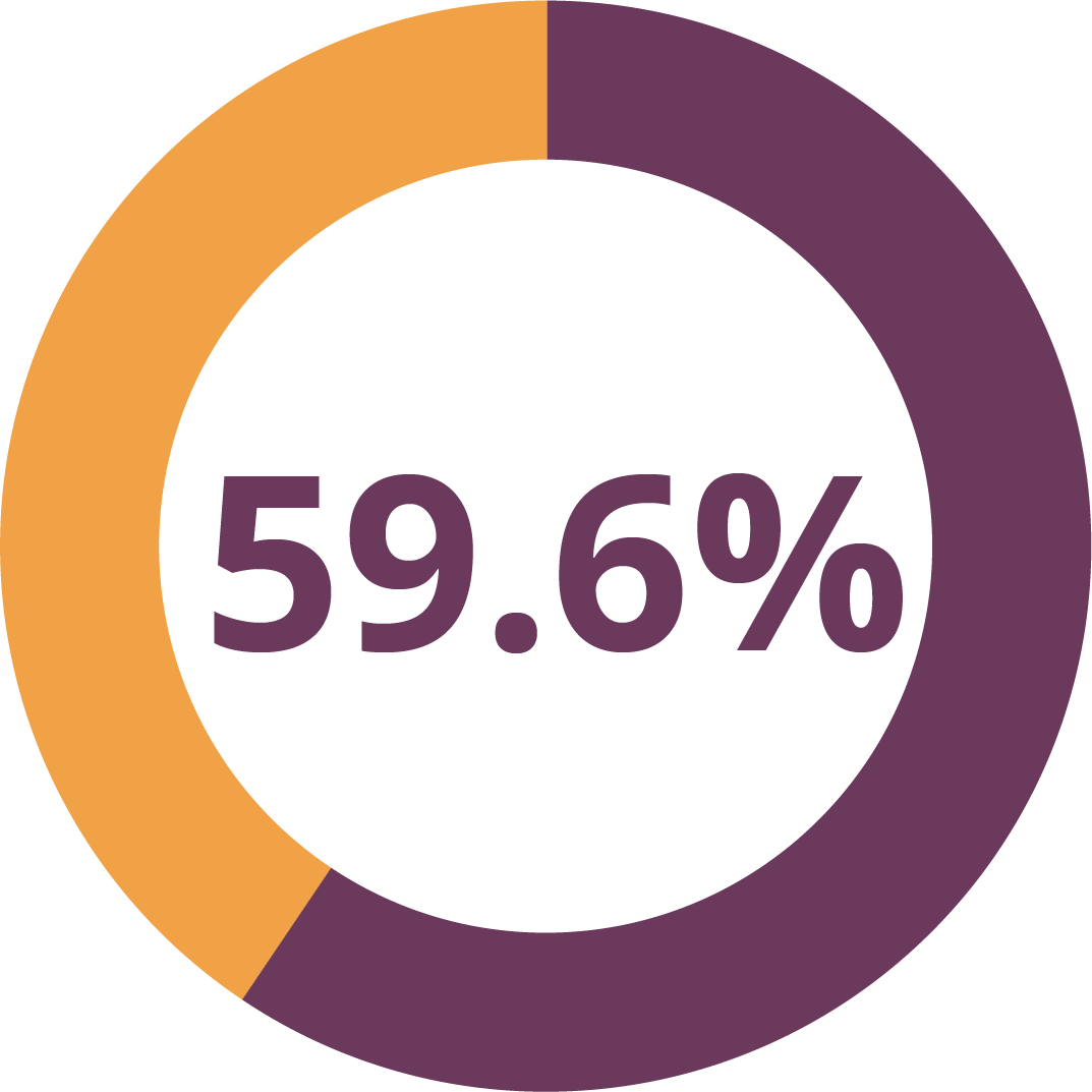
While looking for opportunities to improve, I also try to bring some wins to my stakeholder’s attention. Who just wants to hear about challenges?
I found that nearly 60% of users actively share resources. This is both a badge of honor and a stellar opportunity! If we know that more than half of users are out there spreading the word about good resources, then how might we make it even easier for users to share? How might we link our great shared resources with the value of membership?
Define
It was time to take all the research and insights about the users and turn it into something of use in understanding how they approach the library and how we might serve them better.
Who are the Users?
After pulling out useful information and behaviors from the survey, I was able to present two distinct user personas:
Meet Myra | Youth Educator
54 yo | 2nd Grade Teacher | Chicago, IL
Myra needs science-based resources about screen time and technology to share with parents in order to support their informed decisions because it can be hard to determine how to best create healthy boundaries.
Myra needs resources to be well-organized, so that she can find what she needs quickly and reliably because her teaching day is even more frantic with remote learning responsibilities.
Meet Sam | Super Dad
32 yo | Physical Therapist | Philadelphia, PA
Sam needs strategies for navigating screen time and technology with his kindergarten-aged son, Damian, because with remote learning during the pandemic he is even more concerned than ever about balance.
Sam needs resources that are easily digestible and simple to put into action since he is a busy professional and would rather spend his time with Damian than reading through lengthy case studies and reports.
How are they engaging with the library?
In addition to the survey data, I was given a few months worth of website analytic data for the Resource Library. I united this data with a heuristic evaluation in order to craft journey maps for the users. These journey maps were used to bring the users’ experiences to life and highlight opportunities that present themselves along the way.

Sam’s Journey: Option One
In this first journey, we follow Sam as he is given a direct link by his son’s teacher to the exact resource he needs.
Even a positive experience can leave openings for improvement. For example on this journey through the site, Sam finds the page functional and the call to action button clear and is pleased with the resource he downloads.
Though he leaves satisfied, there is still a missed opportunity to align with the business goal of turning visitors into members. The call to action is way at the bottom! Users so rarely continue reading once they find what they came for. Since the download button (the whole reason Sam came) is at the top, we might try featuring membership near the top to catch Sam’s attention.


Sam’s Journey: Option Two
On this journey through the site, Sam was given a link to the Resource Library landing page instead of straight to a resource.
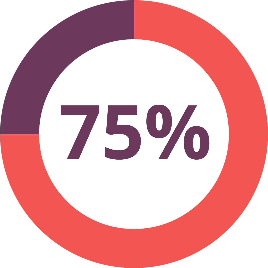
With a bounce rate of 52% and an exit rate of 46%, half of users are leaving without clicking on a resource in the library. Reviewing this journey highlights a few potential flashpoints that could cause Sam to abort his mission to find help for his screen time worries.

Hick’s Law
With 196 resources at the time of writing this, 8 primary filters, and 53 secondary filters, arriving at the top of the Resource Library can be a bit overwhelming. Hick’s Law reminds us that too many choices can lead to a stressed cognitive load and overall frustration. Now make some of these choices muddled and confusing, and the potential issue goes from bad to worse.

Competitor Insight
The competitive research bore out some ideas on how one might guide users through engagement with the site by setting super filters based on a basic usage track. For example, you can see that Common Sense breaks up its sites based on if you are a parent, an educator, or an advocate. I could argue that some of the words and terms they use are still pretty confusing, they do a great job of getting at the core reason the person is visiting the site and guiding them speedily onward.

Myra’s Journey
Myra begins her journey at the homepage for the Children’s Screen Time Action having gotten a tip from a colleague that they would have great resources for her.
Even when our user is a pro at finding resources like Myra, poorly articulated information architecture and broken features can cause fatigue.
When selecting category titles and filter terms, it’s crucial that they are clear and unambiguous. If the users affordance of a term doesn’t match it’s application, confusion can build.
For instance, what is the difference between a plan, a guide, a handout, and a tool?


Competitor Insight
Again a competitor, in this case the Owl House School, gives an illustration of how simplicity could work here. They employ three simple categories of resources (audio/video, publications, organizations) with little left to individual interpretation.
It’s because of the information architecture complexities and potential pitfalls with labels and categories, I will be testing navigation and filtering parameters to see just how best to structure the library as we move into design and iteration.
Next Steps
Working with nonprofits always brings a fun set of idiosyncrasies and I love it. Keeps me on my toes! As I work on the Resource Library, another skilled designer is taking on the overall site refresh. We are both awaiting some keep decisions from stakeholders for the next phases to begin. That said, I know somethings for sure:
Information Architecture
The biggest impact will come from a redesign to the information architecture of the Resource Library including hierarchy of content, filter simplification, and sorting capabilities. A Card Sort may help generate labels that would be best understood by the users.
Testing 1-2-3
On the heels of IA, the new navigation and filtering structure will be tested using a Tree Test, perhaps two in order to simultaneously test different labels to compare how terms perform.
Content
Along with high level design recommendations, I suggested some refinement to the content in the library itself. For instance over 61% of users asked for more podcasts and articles bring more challenges than value. They bulk up the number of resources without much value add while frustrating users when they end up behind paywalls or archives.
Low Hanging Fruit
I always like to give at least one easy to apply piece of feedback for a quick win – who doesn’t like a win? Adding Featured Images to the resources will not only provide value to the listing, but a little more joy in the pursuing as well. Clean up the noise from showing the tags on every resource and things are already much improved!
Thank you!
I really appreciate you taking the time to learn about how I work. Feel free to learn more about me or reach out to connect about this project or a brand new one!